Have you ever given out 5000 flyers in a major city and found that only 2 out of 10 people actually read it? Or that when you hand your business card out, it doesn’t represent YOU at all, rather, a template from a huge company that just wants to churn out millions of cheap cards for less than the price of a coffee?
Well, there might be a reason that you avoid these things, Mostly because they want to take from you. There isn’t a reason for you to interact with it otherwise. So with this in mind, how can you improve what you’re handing out, to make people take more interest.
I believe it comes down to two factors.
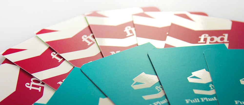
What is it? – What are you handing out exactly? A cheap piece of paper with text? A high gloss ugly business card printed for less than a cup of coffee?
Why? – What do you want from that flyer? What do you want to get back from that business card? What information on that flyer would I have not got otherwise?
You have to get the right balance between these two to make it successful, however, I’d tip in favour of the “What is it” than the “Why“, simply because this happens to us all. By nature, we love things that look and feel nice, you’ll find yourself not throwing away things because they feel like they’re quality, like they have a purpose other than intended.
Lets focus on the printing aesthetic:
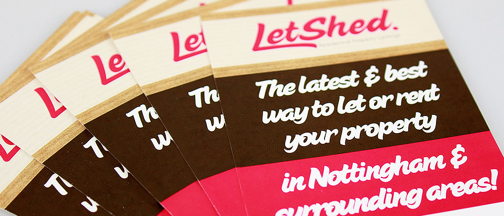
With Flyers, Once you’ve got the print design out of the way, you can get a desired effect by changing the type of paper you print on. Rather than printing on 80gsm paper (Standard home printer paper), print on a much thicker paper. 300gsm is a great thickness for flyers, it gives it a ridged profile, and is less likely to be folded / creased and forgotten. with these, you can get full lithographic print which gives you fantastic quality, and you can really play around with what is on the flyer.

