World Nursery Rhyme Week

Branding, Web Design, Web Development

World Nursery Rhyme Week Logo Design

Bringing playful branding to life alongside website design and development

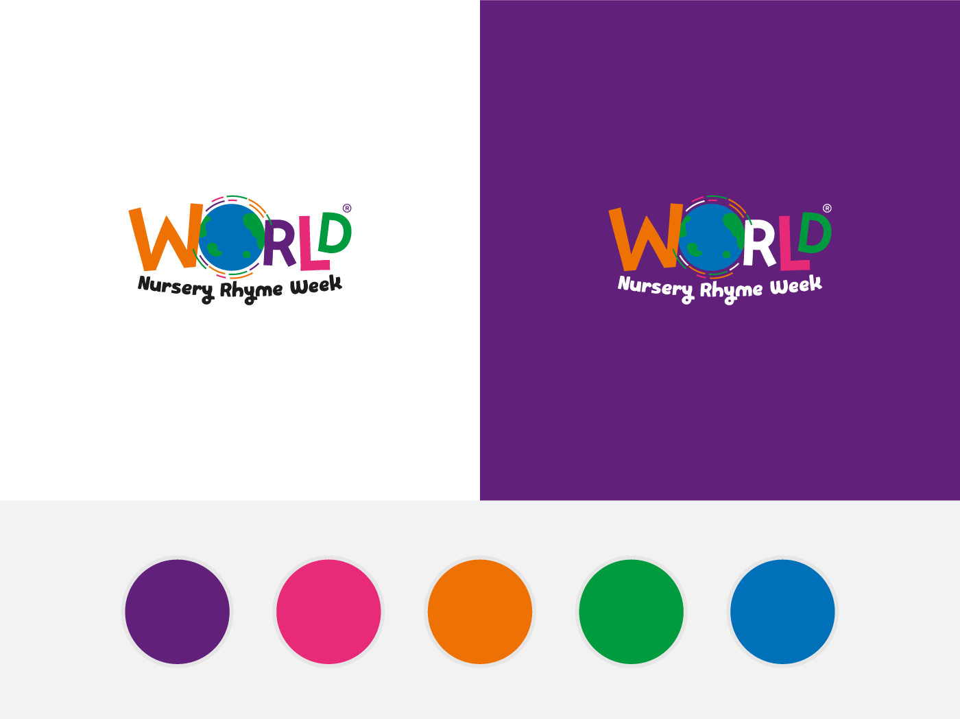
Founded by Music Bugs and launched in 2013 World Nursery Rhyme week wanted to move away from their old branding and go in a more bold and bright direction. Their aim was to appeal to parents, teachers and corporate partners while still keeping the branding modern and slightly quirky.
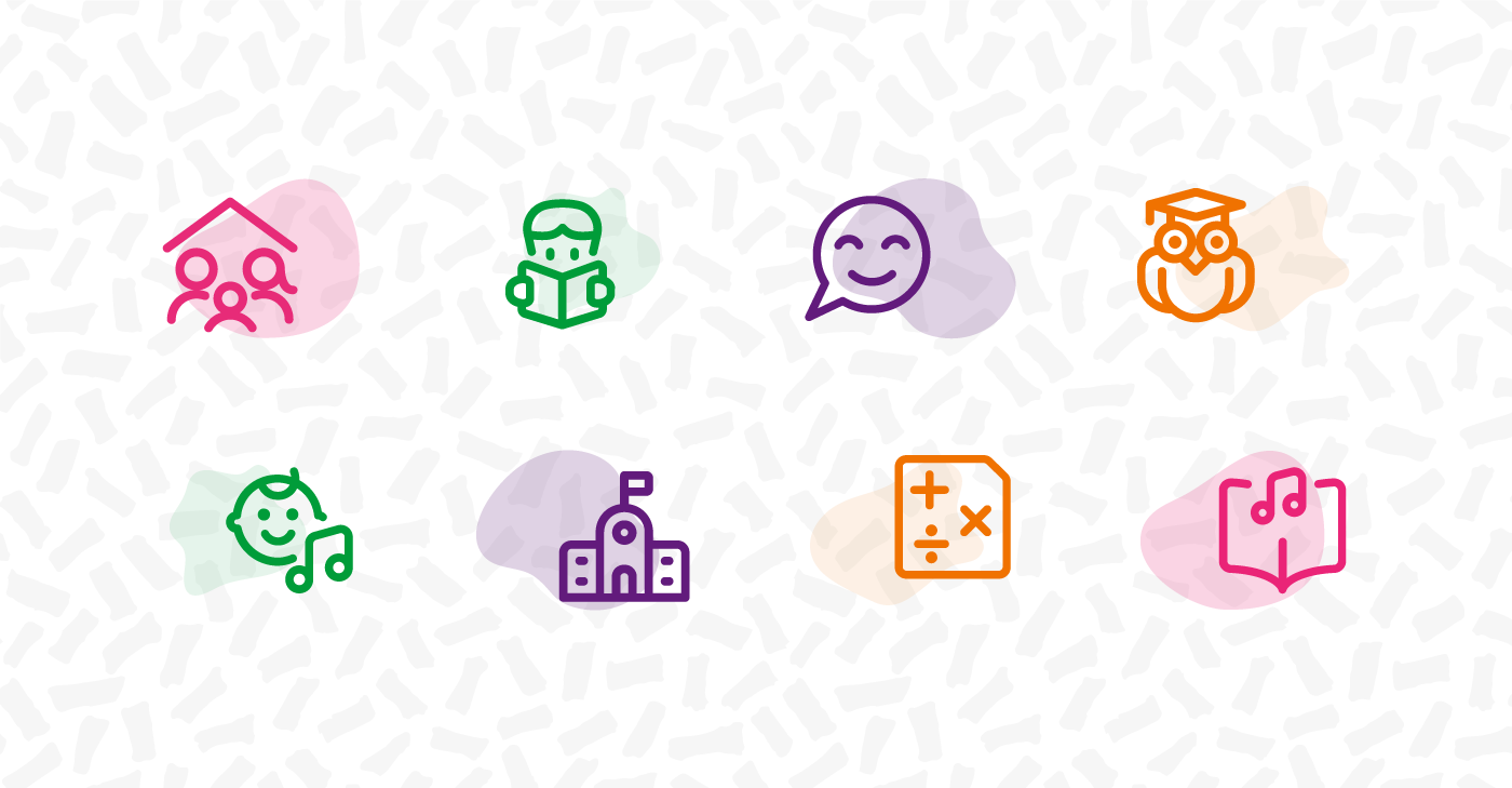
WNRW Icons

Typography

Let the Type Do the Talking

To support the colourful direction World Nursery Rhyme Week wanted to take we felt that choosing an informal playful typeface would strengthen this direction. We chose two typefaces for the logo, we changed the sizing and orientation for letters in the word ‘World’ to reinforce the playful aspect of the branding and picked a lively child-like supporting typeface to make the link between the branding and the services World Nursery Rhyme week provide.

Web Design & Development

Easily Accessible Resources

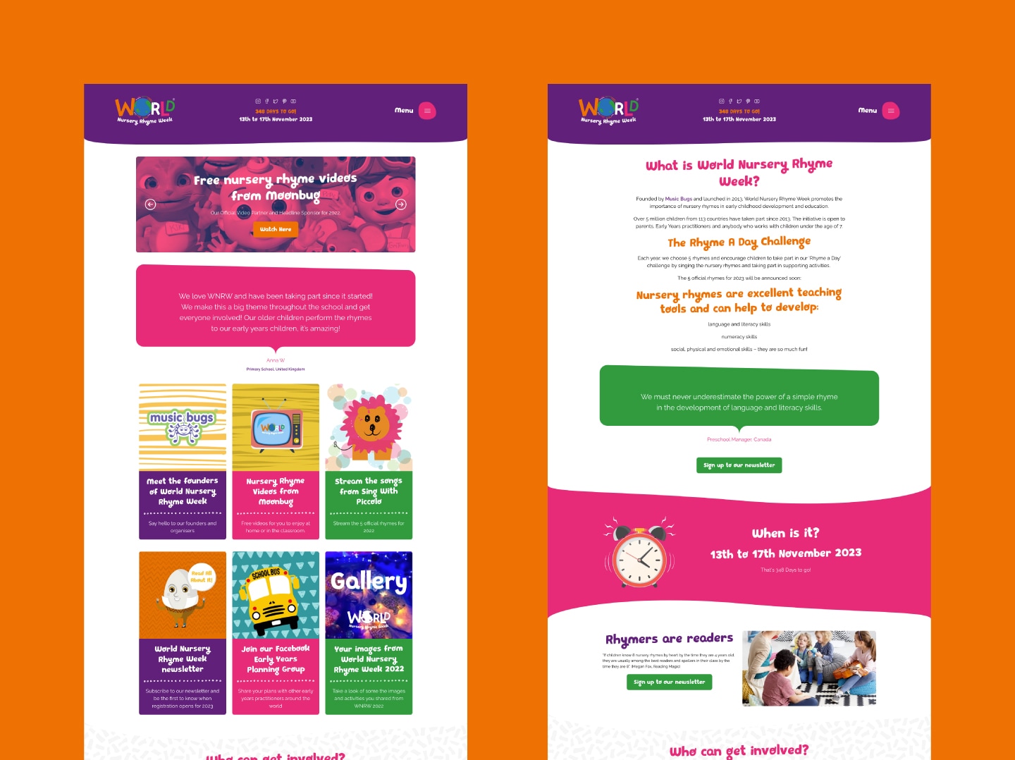
The purpose of the website was to provide easy access to information and resources for parents and teachers who wanted to take part in World Nursery Nursery Rhyme week, things like videos and activity downloads were all taken into consideration when designing and developing the website. We also provided a clear and easy way for parents and teachers to sign up for World Nursery Rhyme week.

WNRW Web Pages
Ecommerce,
WooCommerce,
Brochures,
Leaflets,
Websites,
WordPress,
Menus,
Logo Design,
Social Media Posts,
Business Cards,
Ecommerce,
WooCommerce,
Brochures,
Leaflets,
Websites,
WordPress,
Menus,
Logo Design,
Social Media Posts,
Business Cards,
Ecommerce,
WooCommerce,
Brochures,
Leaflets,
Websites,
WordPress,
Menus,
Logo Design,
Social Media Posts,
Business Cards,

Let's talk about your next project